This Blog Needs More Orange

13 02 2010

I Know Just the Thing

Pauly D uploaded another picture of himself on Guys with iPhones. More than a few not-quite-household names have been self-commodifying on that shallow, filthy site of late. A recent Gawker article speculates on this gay-for-display phenomenon, so I won’t launch into any theories here. But yes, I do think that the placement of his pics on GWIP is as cold and calculated as the stony stare in the picture itself, and in this case no, I don’t think that Pauly D is the one doing the calculating.

I love the design of this website but hate that this website exists.

3 Things I Really Like About Pauly D

  1. Despite (or perhaps in part because of) the narcissism and the posturing, he oozes hypermasculinity. I realize a lot of that’s the pecs and the guns—but it’s also, for some reason, the idiolect. I loves me a good old-fashioned colossal ego, especially when it’s often-voiced. It’s like watching a cartoon.
  2. The bulletproof blowout (may or may not be an extension of #1). Oh, like you’re not stuck at one place in time with something? His hairstyle is a talking point that detractors revisit time and time again, but I’d be surprised if he ditched it. It’s become a part of his brand. Personally, I think excessive product is hot in guys’ hair. Pauly D’s blowout is amazing.
  3. His motorcycle’s wheels have spinners. Enough said.

Precedent. Oh, did you think there was none?

3 Things I Find Regrettable About Pauly D

  1. The excessive grooming and preening. The orange tan I don’t mind at all because his hair, eyes and complexion are all dark enough for him to get away with it. But unless they’re so hirsute that their eyebrows connect over the nose, dudes should not tweeze. At all. You can always tell, and it makes them seem girly.
  2. The Cadillac tattoo. Does Cadillac own him? Are they afraid he’ll get cattle-rustled and re-sold to another ranch, like the Lazy Kia or the Double Hyundai? If we’re going to be totally honest (and we are), getting a reality television personality to tattoo a brand logo on their body in exchange for a large check would probably net somebody a promotion. It would also be less disturbing than somebody voluntarily wearing an enormous car logo on their skin forever. I think tattoos of any kind betray an incredible insecurity, but this one is particularly egregious.
  3. In one of  the back-to-back series premiere episodes—I think it was the second of the two—he casually mused on the fact that it “only takes nine pounds of pressure to break a nose”. I mean, testosterone is hot and all, but I don’t care to have people who keep track of things like that anywhere near me.

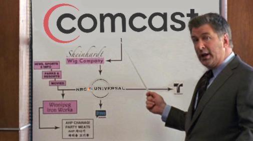
Everything is connected to everything else.

People in Charge of Everything Apparently Unfazed by Depletion of World’s Letter X Reserves

12 02 2010

Future of Tracy Jordan Meat Machine™ Remains Unclear

So today Cοmcast officially becomes Χfinity. You heard me. I have no idea. Maybe Zfinity and Qfinity were both taken. But hey, it’s 2010 (a number, by the way, that sounds like it traveled back from the future to warn us that Disney would buy Marvel); as a kid, I was convinced that what was left of the human race would be wandering half-dead through a nuclear wasteland right about now, so if the worst thing I have to get all snide about at this particular moment is a questionable re-branding choice for a product I couldn’t care less about, I suppose I’m ahead of the game.

Still wrong.

No, wait, that’s not the worst thing I have to get all snide about at this particular moment. Disney. Bought. Marvel. Yawn. Let’s try that again. Disney bought Marvel! And for an obscene amount of money ($4,#@%,#@%,#@%). I know this is old news, and in fact I’d just stopped throwing up in my mouth a little every time I thought about it. But then I must’ve blinked, or something, because the next thing I know the Spider-Man film franchise is getting rebooted just so they can nuke Peter Parker all the way back to high school via some demographic-grabbing ever-prepubescent (if it ends up being a Zac Lautner or a Taylor Efron, as is being speculated, then you will know for sure that Marvel has officially had its balls cut off).

Still wrong.

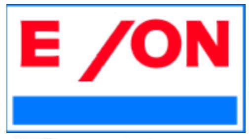
The worst part about this prospect is that, despite casting a hairless Eloi as Spider-Man, they will manage to ‘shop said Eloi up with enough CGI, barely-legal supplements and gratuitous shirtless abdominal shots to commodify this man-child sex object (and by extension the Marvel character) into now-all-too-familiar homoerotic oblivion. Slippery slope my ass: where a teenaged and emasculated Peter Parker rears its smugly head, X-treme Pink Princess She-Hulk® and X-Men Babies® cannot be far behind. Which of course will result in even more squandering of our precious letters X.

One mega-merged half of the world’s second-largest publicly traded company called. It wants its “X” back.

Like most non-renewable resource crises, this rampant over-consumption of the letter X really took off in the consonant-guzzling 1970s. So once again we come to find that the 1970s ruined something for the rest of us. No surprises there.


In the Summer, In the Spring; In Public Places

23 09 2009

On An Island Far Away, Lemonade with My Co Co Co

Coco Before Chanel is Coco before Chanel. This movie is enjoyable. It was a little too long, even by biopic standards, but it’s nice to look at so I didn’t really mind. As a period piece, Coco Before Chanel called for some pretty odd set dressing (e.g., fin de siècle rural French orphanage). I guess my point in mentioning this is that somebody did a really nice job with the details, because I believed every frame. And here’s the skinny on the plot: Coco Chanel is depicted as extremely hardened, pragmatic and self-reliant—which is what the viewer expects, given the implied pattern of abandonment to which she is subjected. Of course, then, the introduction and inevitable removal of a tragic “one true love”  makes for great cinema. Millinery improvisation and melodramatic scissor-snipping are kept to a tolerable minimum.

Even though this film’s not about Chanel the brand, it does end with an amazing coda, or whatever, which involves a parade of models and which is probably flawless in composition. In fact, I hope this part ends up on YouTube, because I want to watch it, like, a hundred times in a row.

Okay, good enough. Now comes the fun part:

Fruits Basket-esque

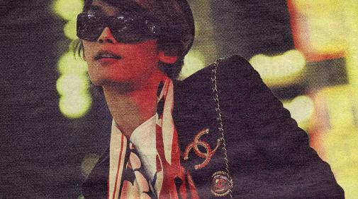
Chanel overload (photograph by Sebastian Kim, Interview, 2009; obviously, this shitty scan detail doesn’t do it justice—click here for full image)

Eyeing C Chart

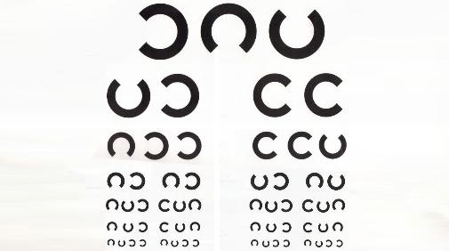
Iconic sans-serif C as “piercings”  in eye chart (Symbol Soup, 1999)

Untrust me.

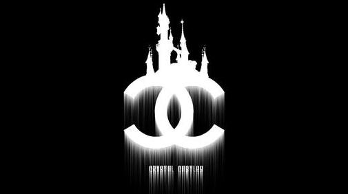
Chanel logo as band logo (allows for endless official and fan-art variations).

I didn't need to change the font--it was eerily identical.

A little something I freaked last year.


Re-Wrought Mascot, Thought Hot, Not

18 08 2009

Not a Lot of Thought Brought to Fraught Plot

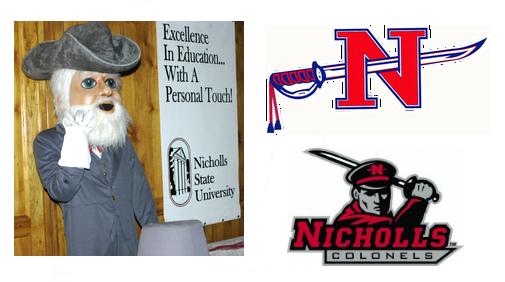
An unheard-of Southern university that nobody cares about just shelled out $30K for a new logo and mascot for their team sports program (whose athletes go by “The Colonels”, in reference to some unheard-of Confederate hero that nobody cares about either). Everyone’s having trouble digging up an image of the old logo and mascot, which should really come as no surprise, since the new mascot—or at least his kind—is notorious for gassing the elderly and the infirm. I did come across this ornery feller, whose photo was tagged as “old nicholls mascot”:

masgot, mein gott!

Old mascot (or variant; who knows or cares), left. Old logo, top right. New logo, always right.

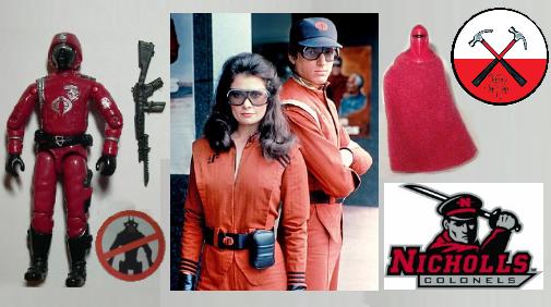
The old logo is slightly more patriotic-looking, I guess, although technically it does still feature some pretty severe impalement. The new logo, meanwhile, keeps some very respectable company:

The latest in a long, proud line of wearers of the blood-red, black and gray

What are you waiting for? Join the club. We said JOIN THE CLUB.


Vandal I’s

8 09 2008

Idaho University Vandals Recall, Alter Poorly-Designed Football Uniform

Nike sponsored the uniforms, and claims they were manufactured according to design specifications. Idaho insists that the “I” logo was supposed to be higher up, at the belt line. They actually played in these uniforms, as seen here.

Of course the sweat pant butt writing trend—Victoria’s Secret “pioneered” it, right?—comes immediately to mind. That look was tired the second I laid eyes on it. You’re not cute.

Apparently the logos were stitched onto the uniform, and have already been removed. Not in my universe, however. I freaked the image below, if for no other reason, because I could.

There’s blog-clog on this thing all over the place, but if you want the unfortunate details, here’s a link to get you started:

http://www.idahostatesman.com/235/story/493284.html