Re-Wrought Mascot, Thought Hot, Not

18 08 2009

Not a Lot of Thought Brought to Fraught Plot

An unheard-of Southern university that nobody cares about just shelled out $30K for a new logo and mascot for their team sports program (whose athletes go by “The Colonels”, in reference to some unheard-of Confederate hero that nobody cares about either). Everyone’s having trouble digging up an image of the old logo and mascot, which should really come as no surprise, since the new mascot—or at least his kind—is notorious for gassing the elderly and the infirm. I did come across this ornery feller, whose photo was tagged as “old nicholls mascot”:
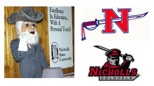
masgot, mein gott!

Old mascot (or variant; who knows or cares), left. Old logo, top right. New logo, always right.

The old logo is slightly more patriotic-looking, I guess, although technically it does still feature some pretty severe impalement. The new logo, meanwhile, keeps some very respectable company:
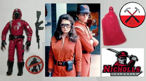
The latest in a long, proud line of wearers of the blood-red, black and gray

What are you waiting for? Join the club. We said JOIN THE CLUB.


Vandal I’s

8 09 2008

Idaho University Vandals Recall, Alter Poorly-Designed Football Uniform

Nike sponsored the uniforms, and claims they were manufactured according to design specifications. Idaho insists that the “I” logo was supposed to be higher up, at the belt line. They actually played in these uniforms, as seen here.

Of course the sweat pant butt writing trend—Victoria’s Secret “pioneered” it, right?—comes immediately to mind. That look was tired the second I laid eyes on it. You’re not cute.

Apparently the logos were stitched onto the uniform, and have already been removed. Not in my universe, however. I freaked the image below, if for no other reason, because I could.

There’s blog-clog on this thing all over the place, but if you want the unfortunate details, here’s a link to get you started:

http://www.idahostatesman.com/235/story/493284.html